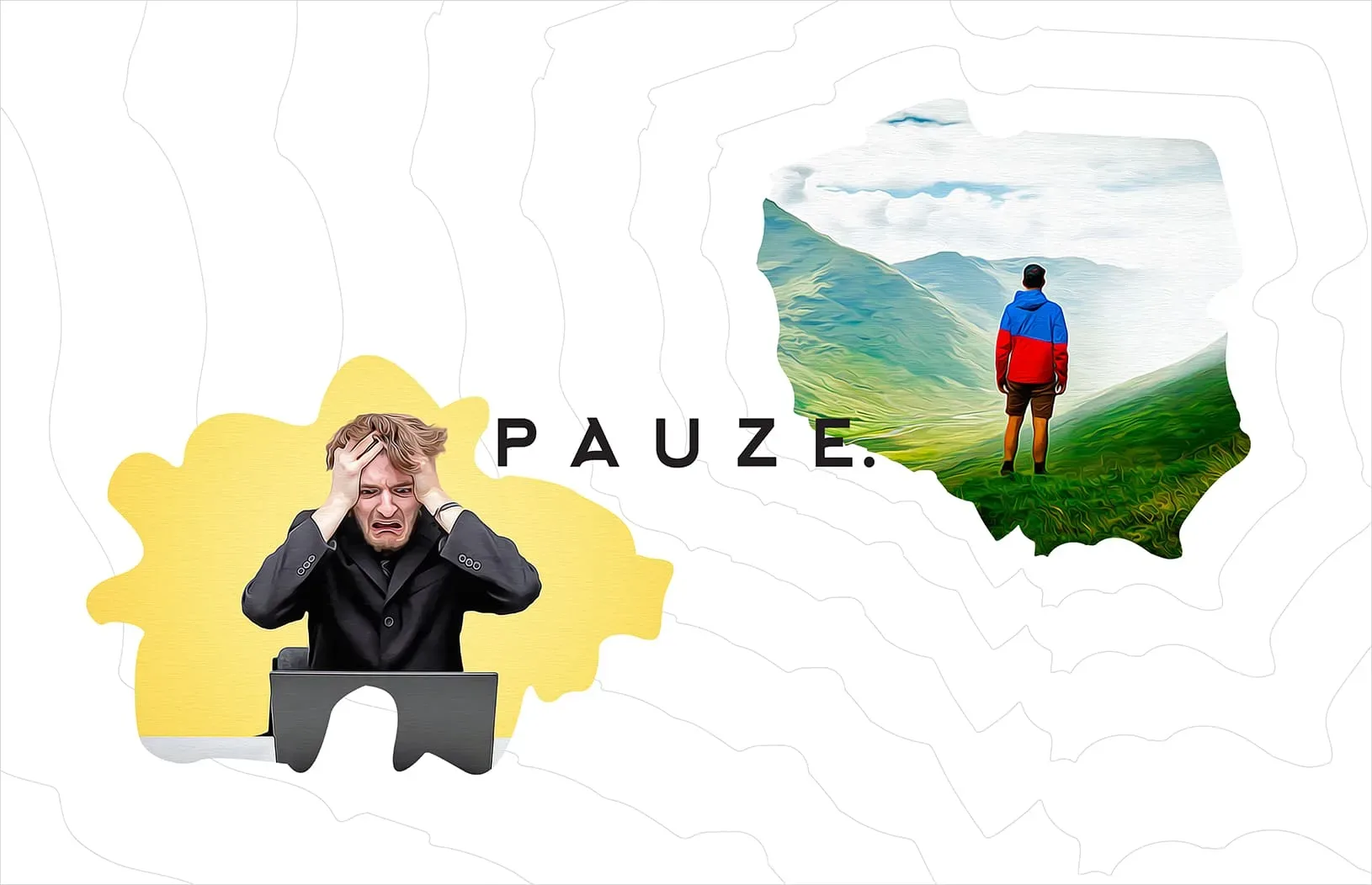
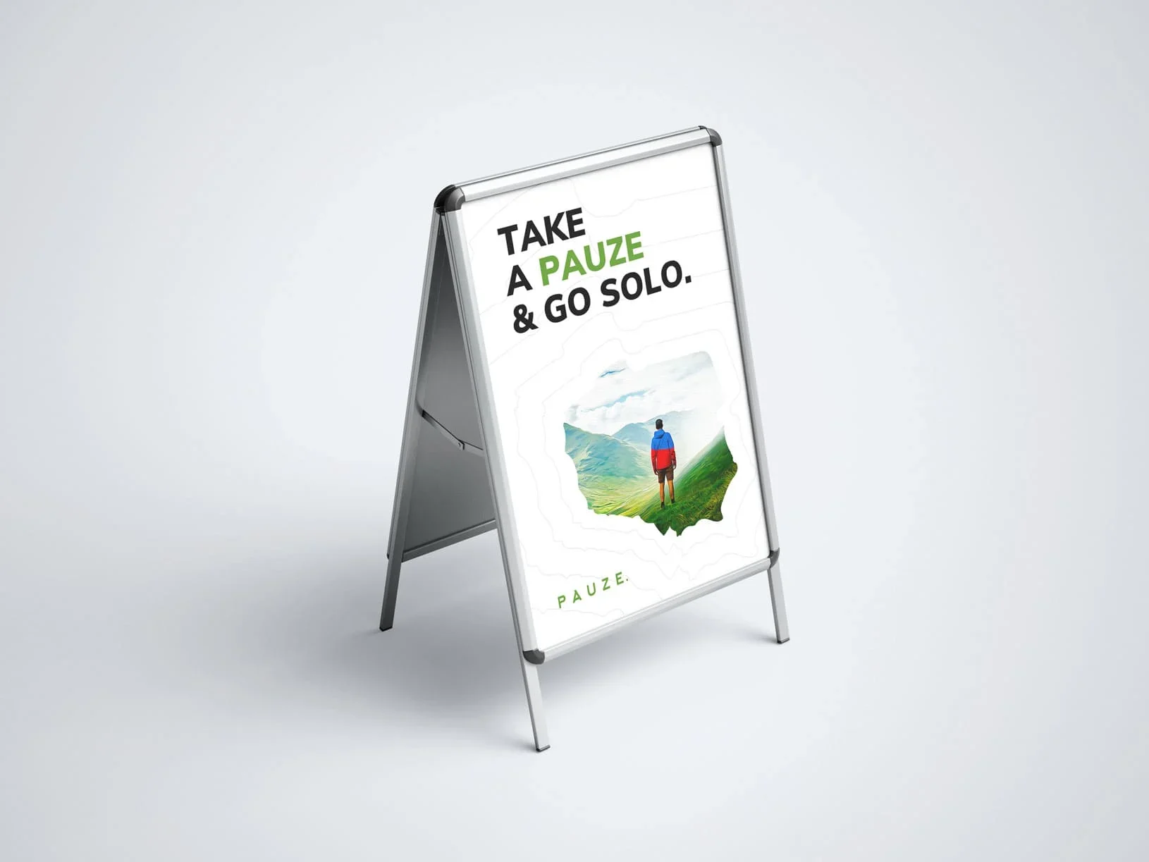
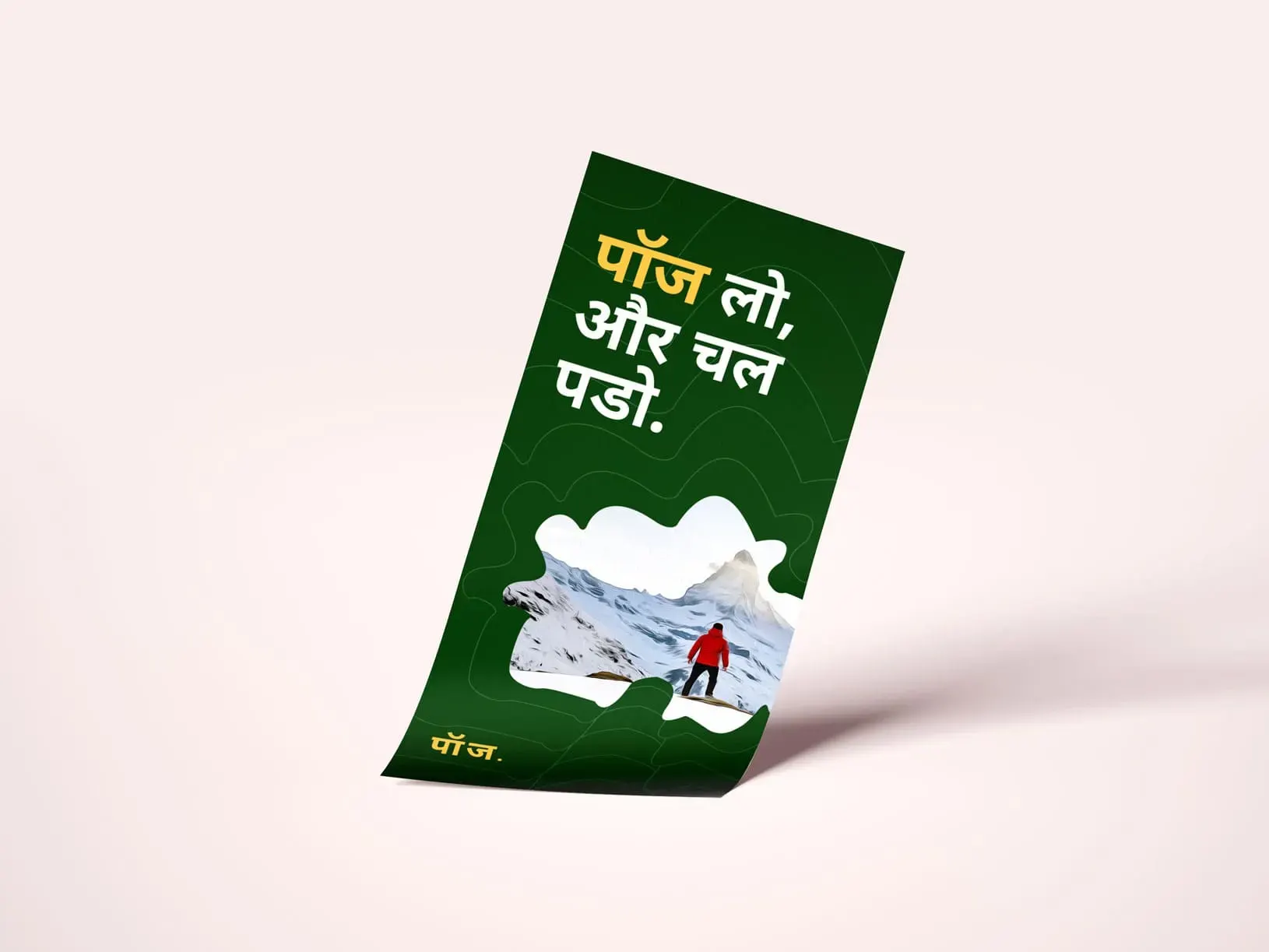
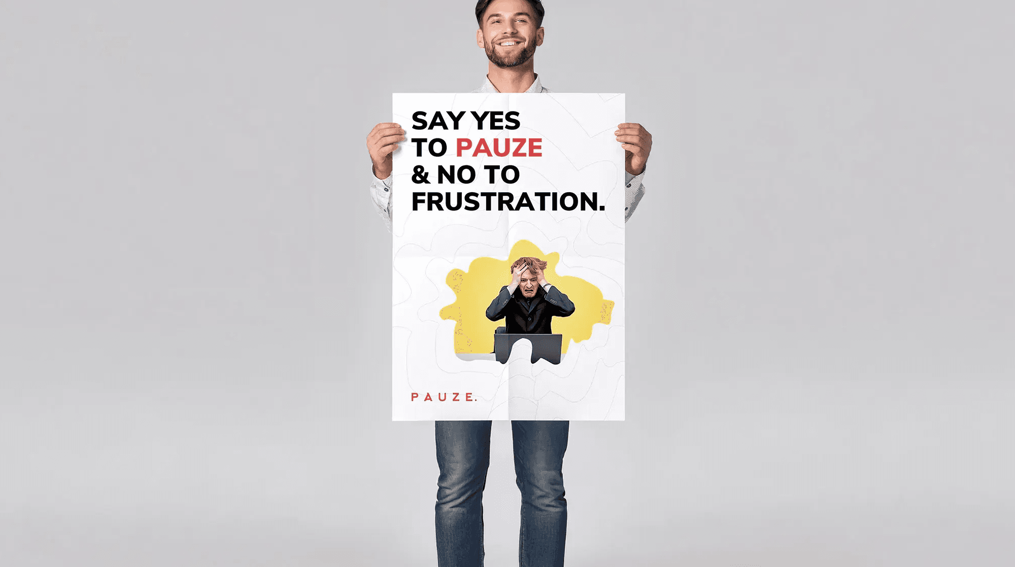
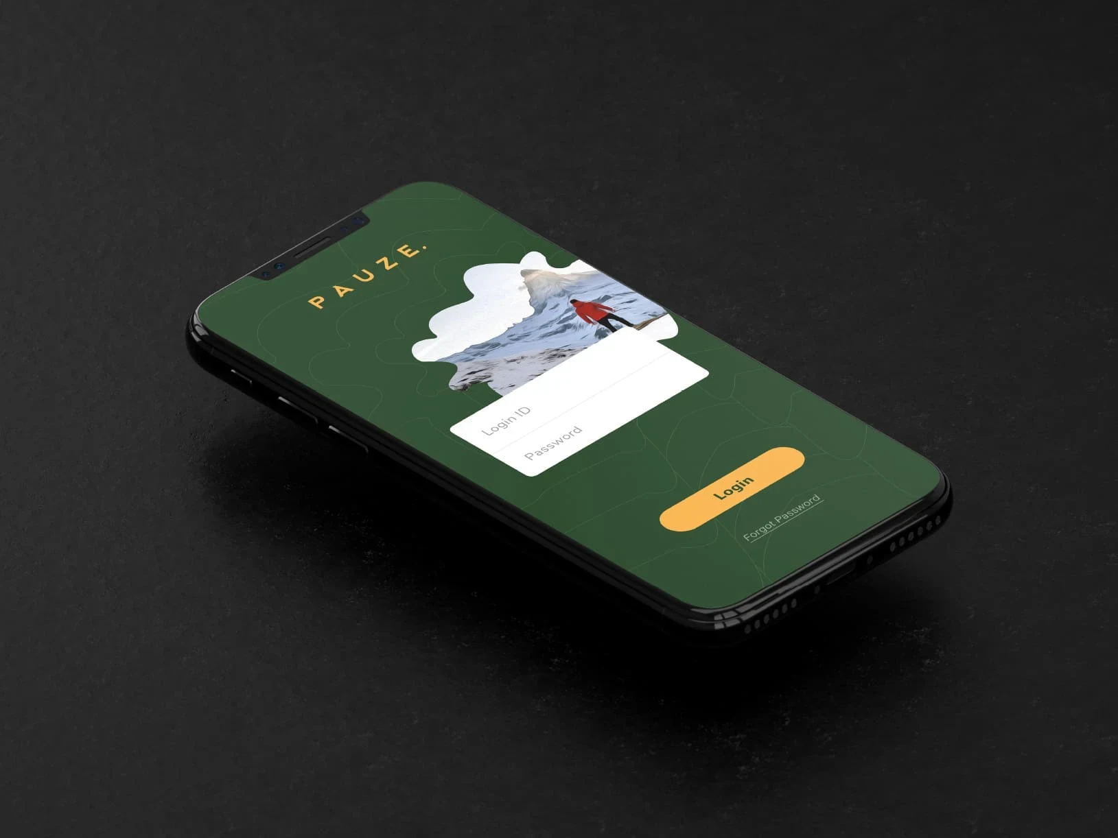
Pauze is a travel agency that offers travellers a one-stop place for their travel trips planning and bookings.
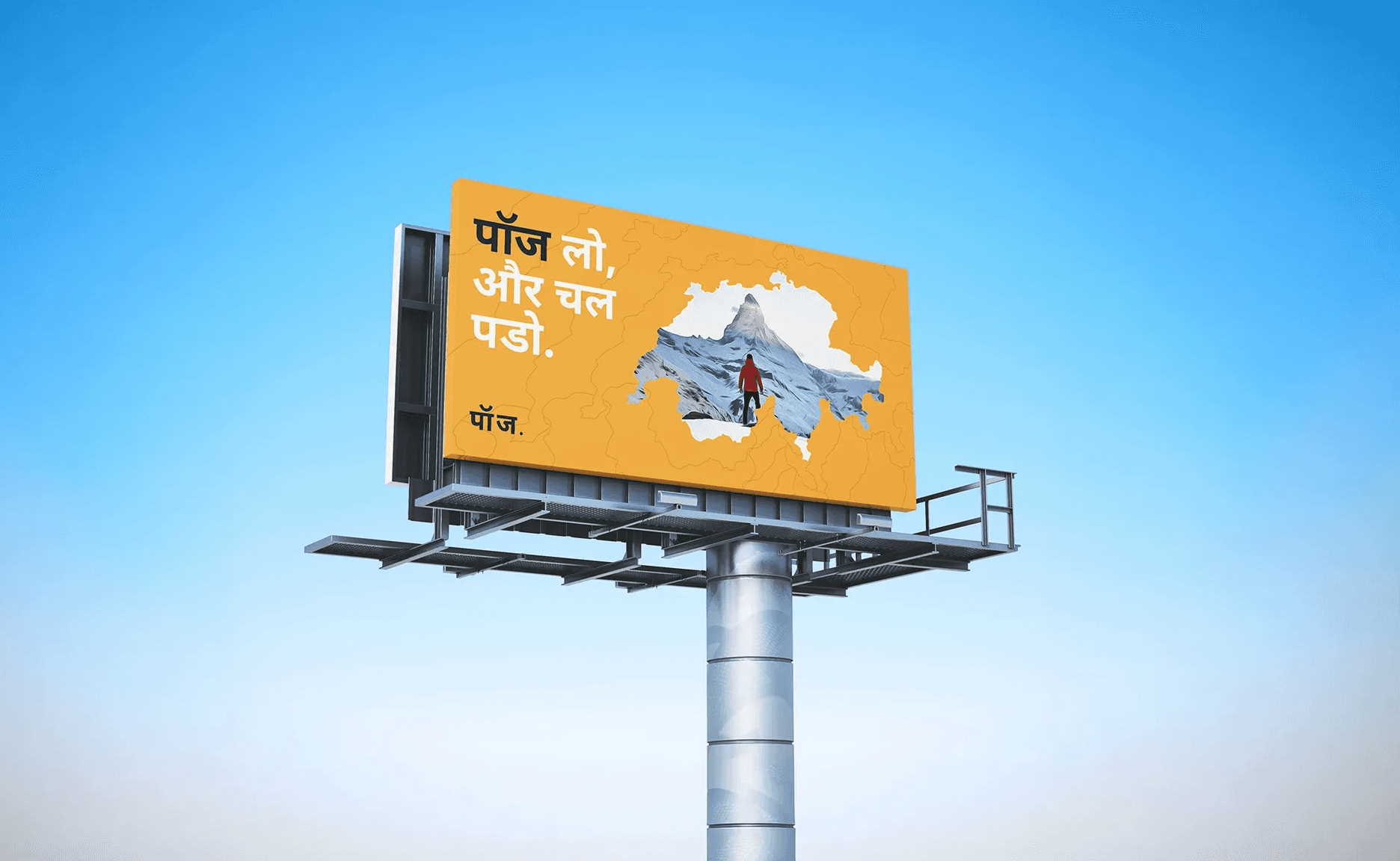
They believe in and strive for connecting people with places and making the travellers undergo beautiful and unique experiences that the destination offers. Pauze as a brand wants their customers to be travellers rather than being just a tourist, live the experience instead of just visiting the places and make a special connection with the destination they are visiting. It gives a break from usuals and offers ways to see something beautiful and unexplored outside in the world.
" width="68.77999905395508px"><g d="M 12.674 2.123 C 12.695 2.123 12.716 2.125 12.737 2.127 L 12.848 2.134 L 12.995 2.129 C 13.078 2.126 13.16 2.123 13.243 2.123 C 19.356 2.123 24.33 7.019 24.33 13.039 C 24.32 16.088 23.031 18.993 20.777 21.046 L 19.663 22.062 L 21.004 22.762 C 24.645 24.663 26.906 28.36 26.906 32.412 C 26.906 38.431 21.933 43.328 15.82 43.328 L 4.223 43.328 C 3.083 43.328 2.156 42.415 2.156 41.293 L 2.156 4.158 C 2.156 3.036 3.083 2.123 4.223 2.123 Z M 15.82 45.452 C 23.122 45.452 29.063 39.602 29.063 32.412 C 29.063 28.04 26.858 24.013 23.226 21.602 C 25.312 19.24 26.486 16.19 26.486 13.04 C 26.486 5.85 20.545 0 13.243 0 C 13.136 0 13.028 0.003 12.921 0.007 L 12.881 0.008 C 12.812 0.004 12.745 0 12.675 0 L 4.223 0 C 1.894 0 0 1.865 0 4.158 L 0 41.293 C 0 43.586 1.894 45.451 4.223 45.451 L 15.82 45.451 Z" fill="transparent" height="45.452px" id="os1n0rsF7" transform="translate(39.717 0)" width="29.063000000000002px"><path d="M 12.674 2.123 C 12.695 2.123 12.716 2.125 12.737 2.127 L 12.848 2.134 L 12.995 2.129 C 13.078 2.126 13.16 2.123 13.243 2.123 C 19.356 2.123 24.33 7.019 24.33 13.039 C 24.32 16.088 23.031 18.993 20.777 21.046 L 19.663 22.062 L 21.004 22.762 C 24.645 24.663 26.906 28.36 26.906 32.412 C 26.906 38.431 21.933 43.328 15.82 43.328 L 4.223 43.328 C 3.083 43.328 2.156 42.415 2.156 41.293 L 2.156 4.158 C 2.156 3.036 3.083 2.123 4.223 2.123 Z M 15.82 45.452 C 23.122 45.452 29.063 39.602 29.063 32.412 C 29.063 28.04 26.858 24.013 23.226 21.602 C 25.312 19.24 26.486 16.19 26.486 13.04 C 26.486 5.85 20.545 0 13.243 0 C 13.136 0 13.028 0.003 12.921 0.007 L 12.881 0.008 C 12.812 0.004 12.745 0 12.675 0 L 4.223 0 C 1.894 0 0 1.865 0 4.158 L 0 41.293 C 0 43.586 1.894 45.451 4.223 45.451 L 15.82 45.451 Z" fill="rgb(255, 255, 255)" height="45.452px" id="ikVZND_nY" width="29.063000000000002px"/></g><g d="M 15.873 2.123 C 23.385 2.149 29.489 8.176 29.489 15.579 C 29.489 19.158 28.023 22.718 25.469 25.344 C 22.862 28.026 19.436 29.501 15.822 29.501 L 14.742 29.501 L 14.742 41.293 C 14.742 42.415 13.815 43.328 12.675 43.328 L 4.223 43.328 C 3.083 43.328 2.156 42.415 2.156 41.293 L 2.156 4.158 C 2.156 3.036 3.083 2.123 4.223 2.123 Z M 16.898 41.293 L 16.898 31.588 C 20.704 31.322 24.266 29.65 27.026 26.813 C 29.961 23.795 31.645 19.699 31.645 15.579 C 31.645 7.023 24.605 0.056 15.928 0 L 4.223 0 C 1.895 0 0 1.865 0 4.158 L 0 41.293 C 0 43.586 1.895 45.451 4.223 45.451 L 12.675 45.451 C 15.004 45.451 16.898 43.586 16.898 41.293 Z" fill="transparent" height="45.451px" id="MK_sq4_Cc" width="31.645000000000003px"><path d="M 15.873 2.123 C 23.385 2.149 29.489 8.176 29.489 15.579 C 29.489 19.158 28.023 22.718 25.469 25.344 C 22.862 28.026 19.436 29.501 15.822 29.501 L 14.742 29.501 L 14.742 41.293 C 14.742 42.415 13.815 43.328 12.675 43.328 L 4.223 43.328 C 3.083 43.328 2.156 42.415 2.156 41.293 L 2.156 4.158 C 2.156 3.036 3.083 2.123 4.223 2.123 Z M 16.898 41.293 L 16.898 31.588 C 20.704 31.322 24.266 29.65 27.026 26.813 C 29.961 23.795 31.645 19.699 31.645 15.579 C 31.645 7.023 24.605 0.056 15.928 0 L 4.223 0 C 1.895 0 0 1.865 0 4.158 L 0 41.293 C 0 43.586 1.895 45.451 4.223 45.451 L 12.675 45.451 C 15.004 45.451 16.898 43.586 16.898 41.293 Z" fill="rgb(255, 255, 255)" height="45.451px" id="BSb6VCqnQ" width="31.645000000000003px"/></g><path d="M 5.628 2.222 C 5.854 2.401 5.967 2.659 5.967 2.995 C 5.967 3.159 5.921 3.319 5.835 3.459 C 5.747 3.606 5.637 3.741 5.505 3.866 C 5.372 3.991 5.229 4.105 5.075 4.208 C 4.92 4.311 4.777 4.4 4.645 4.476 C 4.546 4.389 4.438 4.291 4.323 4.183 C 4.096 3.971 3.909 3.72 3.769 3.443 C 3.703 3.307 3.67 3.169 3.67 3.027 C 3.67 2.702 3.78 2.442 4 2.246 C 4.22 2.051 4.49 1.953 4.81 1.953 C 5.106 1.945 5.395 2.04 5.628 2.222 Z M 6.083 9.115 C 5.808 9.354 5.529 9.555 5.248 9.717 C 4.968 9.881 4.634 9.961 4.248 9.961 C 4.05 9.961 3.854 9.926 3.661 9.856 C 3.468 9.785 3.3 9.691 3.157 9.571 C 3.014 9.451 2.898 9.305 2.81 9.131 C 2.721 8.958 2.678 8.763 2.678 8.546 C 2.673 8.35 2.713 8.155 2.793 7.976 C 2.869 7.815 2.972 7.669 3.099 7.544 C 3.226 7.42 3.369 7.306 3.529 7.203 C 3.69 7.099 3.852 6.998 4.017 6.901 Z M 11.604 5.876 L 8.728 5.876 L 7.587 7.406 L 6.083 5.828 C 6.381 5.675 6.658 5.499 6.918 5.298 C 7.174 5.1 7.405 4.87 7.604 4.614 C 7.8 4.364 7.958 4.087 8.075 3.792 C 8.191 3.5 8.248 3.18 8.248 2.832 C 8.248 2.344 8.155 1.923 7.968 1.571 C 7.78 1.218 7.53 0.925 7.215 0.692 C 6.901 0.459 6.54 0.285 6.133 0.17 C 5.725 0.057 5.295 0 4.843 0 C 4.38 0 3.928 0.054 3.488 0.163 C 3.068 0.262 2.67 0.439 2.314 0.684 C 1.972 0.922 1.699 1.226 1.496 1.595 C 1.291 1.964 1.19 2.409 1.19 2.93 C 1.187 3.188 1.218 3.445 1.281 3.695 C 1.341 3.922 1.43 4.141 1.545 4.346 C 1.663 4.555 1.801 4.751 1.959 4.932 C 2.13 5.13 2.303 5.325 2.479 5.518 C 2.126 5.638 1.801 5.798 1.504 5.998 C 1.206 6.199 0.944 6.435 0.719 6.706 C 0.493 6.977 0.316 7.279 0.19 7.609 C 0.063 7.941 0 8.291 0 8.659 C 0 9.235 0.115 9.739 0.347 10.173 C 0.572 10.6 0.892 10.97 1.281 11.255 C 1.682 11.548 2.133 11.765 2.611 11.898 C 3.111 12.04 3.629 12.111 4.149 12.11 C 4.843 12.11 5.469 12.001 6.025 11.784 C 6.581 11.567 7.102 11.215 7.587 10.727 L 8.563 11.817 L 11.753 11.817 L 9.141 9.099 Z" fill="rgb(255, 255, 255)" height="12.11001222531282px" id="m9Jqx58nJ" transform="translate(23.272 33.341)" width="11.753000000000004px"/></g></svg>)