" width="68.77999905395508px"><g d="M 12.674 2.123 C 12.695 2.123 12.716 2.125 12.737 2.127 L 12.848 2.134 L 12.995 2.129 C 13.078 2.126 13.16 2.123 13.243 2.123 C 19.356 2.123 24.33 7.019 24.33 13.039 C 24.32 16.088 23.031 18.993 20.777 21.046 L 19.663 22.062 L 21.004 22.762 C 24.645 24.663 26.906 28.36 26.906 32.412 C 26.906 38.431 21.933 43.328 15.82 43.328 L 4.223 43.328 C 3.083 43.328 2.156 42.415 2.156 41.293 L 2.156 4.158 C 2.156 3.036 3.083 2.123 4.223 2.123 Z M 15.82 45.452 C 23.122 45.452 29.063 39.602 29.063 32.412 C 29.063 28.04 26.858 24.013 23.226 21.602 C 25.312 19.24 26.486 16.19 26.486 13.04 C 26.486 5.85 20.545 0 13.243 0 C 13.136 0 13.028 0.003 12.921 0.007 L 12.881 0.008 C 12.812 0.004 12.745 0 12.675 0 L 4.223 0 C 1.894 0 0 1.865 0 4.158 L 0 41.293 C 0 43.586 1.894 45.451 4.223 45.451 L 15.82 45.451 Z" fill="transparent" height="45.452px" id="os1n0rsF7" transform="translate(39.717 0)" width="29.063000000000002px"><path d="M 12.674 2.123 C 12.695 2.123 12.716 2.125 12.737 2.127 L 12.848 2.134 L 12.995 2.129 C 13.078 2.126 13.16 2.123 13.243 2.123 C 19.356 2.123 24.33 7.019 24.33 13.039 C 24.32 16.088 23.031 18.993 20.777 21.046 L 19.663 22.062 L 21.004 22.762 C 24.645 24.663 26.906 28.36 26.906 32.412 C 26.906 38.431 21.933 43.328 15.82 43.328 L 4.223 43.328 C 3.083 43.328 2.156 42.415 2.156 41.293 L 2.156 4.158 C 2.156 3.036 3.083 2.123 4.223 2.123 Z M 15.82 45.452 C 23.122 45.452 29.063 39.602 29.063 32.412 C 29.063 28.04 26.858 24.013 23.226 21.602 C 25.312 19.24 26.486 16.19 26.486 13.04 C 26.486 5.85 20.545 0 13.243 0 C 13.136 0 13.028 0.003 12.921 0.007 L 12.881 0.008 C 12.812 0.004 12.745 0 12.675 0 L 4.223 0 C 1.894 0 0 1.865 0 4.158 L 0 41.293 C 0 43.586 1.894 45.451 4.223 45.451 L 15.82 45.451 Z" fill="rgb(255, 255, 255)" height="45.452px" id="ikVZND_nY" width="29.063000000000002px"/></g><g d="M 15.873 2.123 C 23.385 2.149 29.489 8.176 29.489 15.579 C 29.489 19.158 28.023 22.718 25.469 25.344 C 22.862 28.026 19.436 29.501 15.822 29.501 L 14.742 29.501 L 14.742 41.293 C 14.742 42.415 13.815 43.328 12.675 43.328 L 4.223 43.328 C 3.083 43.328 2.156 42.415 2.156 41.293 L 2.156 4.158 C 2.156 3.036 3.083 2.123 4.223 2.123 Z M 16.898 41.293 L 16.898 31.588 C 20.704 31.322 24.266 29.65 27.026 26.813 C 29.961 23.795 31.645 19.699 31.645 15.579 C 31.645 7.023 24.605 0.056 15.928 0 L 4.223 0 C 1.895 0 0 1.865 0 4.158 L 0 41.293 C 0 43.586 1.895 45.451 4.223 45.451 L 12.675 45.451 C 15.004 45.451 16.898 43.586 16.898 41.293 Z" fill="transparent" height="45.451px" id="MK_sq4_Cc" width="31.645000000000003px"><path d="M 15.873 2.123 C 23.385 2.149 29.489 8.176 29.489 15.579 C 29.489 19.158 28.023 22.718 25.469 25.344 C 22.862 28.026 19.436 29.501 15.822 29.501 L 14.742 29.501 L 14.742 41.293 C 14.742 42.415 13.815 43.328 12.675 43.328 L 4.223 43.328 C 3.083 43.328 2.156 42.415 2.156 41.293 L 2.156 4.158 C 2.156 3.036 3.083 2.123 4.223 2.123 Z M 16.898 41.293 L 16.898 31.588 C 20.704 31.322 24.266 29.65 27.026 26.813 C 29.961 23.795 31.645 19.699 31.645 15.579 C 31.645 7.023 24.605 0.056 15.928 0 L 4.223 0 C 1.895 0 0 1.865 0 4.158 L 0 41.293 C 0 43.586 1.895 45.451 4.223 45.451 L 12.675 45.451 C 15.004 45.451 16.898 43.586 16.898 41.293 Z" fill="rgb(255, 255, 255)" height="45.451px" id="BSb6VCqnQ" width="31.645000000000003px"/></g><path d="M 5.628 2.222 C 5.854 2.401 5.967 2.659 5.967 2.995 C 5.967 3.159 5.921 3.319 5.835 3.459 C 5.747 3.606 5.637 3.741 5.505 3.866 C 5.372 3.991 5.229 4.105 5.075 4.208 C 4.92 4.311 4.777 4.4 4.645 4.476 C 4.546 4.389 4.438 4.291 4.323 4.183 C 4.096 3.971 3.909 3.72 3.769 3.443 C 3.703 3.307 3.67 3.169 3.67 3.027 C 3.67 2.702 3.78 2.442 4 2.246 C 4.22 2.051 4.49 1.953 4.81 1.953 C 5.106 1.945 5.395 2.04 5.628 2.222 Z M 6.083 9.115 C 5.808 9.354 5.529 9.555 5.248 9.717 C 4.968 9.881 4.634 9.961 4.248 9.961 C 4.05 9.961 3.854 9.926 3.661 9.856 C 3.468 9.785 3.3 9.691 3.157 9.571 C 3.014 9.451 2.898 9.305 2.81 9.131 C 2.721 8.958 2.678 8.763 2.678 8.546 C 2.673 8.35 2.713 8.155 2.793 7.976 C 2.869 7.815 2.972 7.669 3.099 7.544 C 3.226 7.42 3.369 7.306 3.529 7.203 C 3.69 7.099 3.852 6.998 4.017 6.901 Z M 11.604 5.876 L 8.728 5.876 L 7.587 7.406 L 6.083 5.828 C 6.381 5.675 6.658 5.499 6.918 5.298 C 7.174 5.1 7.405 4.87 7.604 4.614 C 7.8 4.364 7.958 4.087 8.075 3.792 C 8.191 3.5 8.248 3.18 8.248 2.832 C 8.248 2.344 8.155 1.923 7.968 1.571 C 7.78 1.218 7.53 0.925 7.215 0.692 C 6.901 0.459 6.54 0.285 6.133 0.17 C 5.725 0.057 5.295 0 4.843 0 C 4.38 0 3.928 0.054 3.488 0.163 C 3.068 0.262 2.67 0.439 2.314 0.684 C 1.972 0.922 1.699 1.226 1.496 1.595 C 1.291 1.964 1.19 2.409 1.19 2.93 C 1.187 3.188 1.218 3.445 1.281 3.695 C 1.341 3.922 1.43 4.141 1.545 4.346 C 1.663 4.555 1.801 4.751 1.959 4.932 C 2.13 5.13 2.303 5.325 2.479 5.518 C 2.126 5.638 1.801 5.798 1.504 5.998 C 1.206 6.199 0.944 6.435 0.719 6.706 C 0.493 6.977 0.316 7.279 0.19 7.609 C 0.063 7.941 0 8.291 0 8.659 C 0 9.235 0.115 9.739 0.347 10.173 C 0.572 10.6 0.892 10.97 1.281 11.255 C 1.682 11.548 2.133 11.765 2.611 11.898 C 3.111 12.04 3.629 12.111 4.149 12.11 C 4.843 12.11 5.469 12.001 6.025 11.784 C 6.581 11.567 7.102 11.215 7.587 10.727 L 8.563 11.817 L 11.753 11.817 L 9.141 9.099 Z" fill="rgb(255, 255, 255)" height="12.11001222531282px" id="m9Jqx58nJ" transform="translate(23.272 33.341)" width="11.753000000000004px"/></g></svg>)
One Bite Stand

One Bite Stand: Bringing the Flavour of Gujarat to San Francisco Through Branding
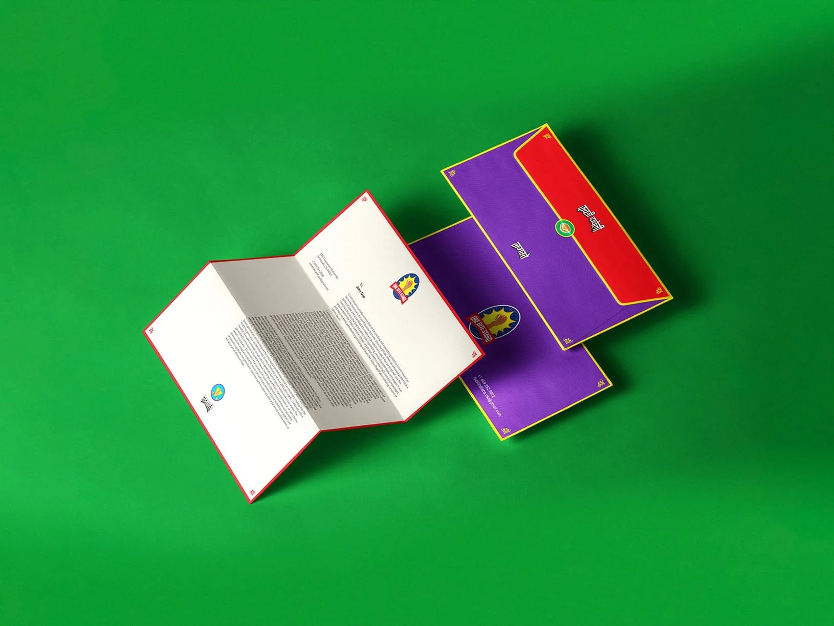
How a bold visual identity turned an iconic Gujarati street food into a distinctive urban food brand.
ood is rarely just about taste. The strongest food brands create an experience before the first bite.
For One Bite Stand, that experience began with a simple idea: bring the authentic flavour of Gujarati Dabeli to San Francisco while creating a brand that could connect with both Indian and international audiences.
The challenge was not simply to create a logo or make the packaging look attractive. It was to build a visual identity that could communicate Indian culture, street-food energy, modernity, and flavour — all at once.
The Brand
One Bite Stand is known for serving authentic Dabeli, a beloved street food from Gujarat, India.
Located in San Francisco's thriving IT hub, the brand serves an audience that includes a large Indian community as well as local food lovers looking for something different.
This created an interesting branding opportunity.
The brand needed to feel familiar to Indians who already knew and loved Dabeli, while also being approachable enough for someone experiencing the dish for the very first time.
That meant the identity had to do more than look Indian.
It had to tell the story of the food.
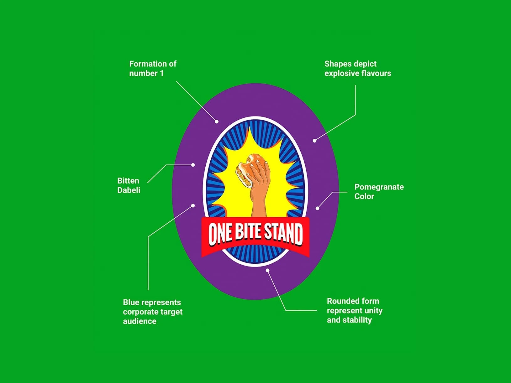
Turning "One Bite" Into a Visual Idea
At the heart of the identity is the logo.
The central illustration of a Dabeli being held in a hand is designed to form the shape of the number 1, directly connecting the visual with the name One Bite Stand.
Around it, burst-like graphic elements communicate the explosive flavours associated with the dish.
The result is a logo that doesn't simply identify the business — it gives the audience a visual cue about what the brand is all about:
One bite. Big flavour.
A subtle bite mark incorporated into the Dabeli illustration adds another layer to the idea, reinforcing the name while giving the identity a playful and memorable character.
A Colour Palette Inspired by the Food
The colour system was developed around the experience of Dabeli itself.
The dominant red takes inspiration from pomegranate seeds, one of the ingredients associated with authentic Dabeli.
Red brings appetite, energy and vibrancy to the identity.
But the brand doesn't rely entirely on traditional food-brand colours.
A contrasting blue introduces a more urban and corporate character, helping One Bite Stand fit naturally into San Francisco's modern working environment.
This balance was intentional.
The identity needed to feel culturally rooted without becoming visually dated.
It needed to say:
This is authentic Indian food — but this is also a contemporary brand.
Building an Indian-Inspired Design System
The rebrand expanded beyond the logo into a broader graphic language.
The visual system combines:
Bold regional colours
Traditional Indian-inspired motifs
Hand-drawn illustrations
Street-food-inspired typography
Playful graphic elements
Food-focused visual storytelling
Together, these elements create an identity that feels energetic and distinctly Indian without relying on stereotypes.
Instead of simply decorating the brand with cultural references, the design system uses those references as part of the storytelling.
The result is a brand that can communicate where the food comes from while still feeling relevant in a contemporary urban environment.
Designing for People Who Have Never Tried Dabeli
One of the most interesting challenges for One Bite Stand was audience education.
For someone from Gujarat or elsewhere in India, Dabeli already carries familiarity.
For an international customer, however, the product may be completely new.
That meant the branding had to create curiosity.
The illustrations, typography, colours and graphic language work together to make the food feel approachable and exciting.
The identity becomes an educational layer around the product — helping people understand that Dabeli isn't simply another sandwich or snack.
It has a story, a culture and a distinctive flavour profile.
When Branding Becomes an Experience
A successful identity shouldn't stop at recognition.
It should influence how people interact with a brand.
For One Bite Stand, the refreshed identity was designed to make the experience more engaging — from the visual language to the way the brand communicates its food and cultural roots.
The goal was to create moments that make people pause, look closer, ask questions and ultimately try the food.
In this sense, branding becomes more than aesthetics.
It becomes part of the customer experience.
The Impact
he rebrand produced a measurable business impact.
Following the brand revamp, One Bite Stand reported a 60% increase in footfall, along with increased engagement from both Indian and international visitors.
More importantly, many visitors were trying Dabeli for the first time.
The new design system helped create greater curiosity and engagement, encouraging people to spend more time interacting with the brand and discovering the story behind the food.
This is where the value of branding becomes clear.
A visual identity isn't successful simply because it looks good.
It becomes successful when it helps people notice, understand, remember and choose a brand.
More Than a Food Brand
One Bite Stand demonstrates how cultural identity and contemporary design can work together.
The brand doesn't hide its Gujarati roots in an attempt to appeal to a global audience.
Instead, it makes those roots part of its biggest strength.
The result is a visual identity that feels:
Authentic enough to represent its heritage.
Modern enough to belong in San Francisco.
Playful enough to attract new audiences.
And most importantly, memorable enough to make people want another bite.
The Takeaway
The best branding doesn't simply tell people what a business sells.
It tells them why they should care.
For One Bite Stand, that meant transforming a traditional Gujarati street food into a contemporary brand experience — one that could introduce Dabeli to a new audience without losing the flavour, culture and personality that make it special.
Because sometimes, all it takes is one bite to create a lasting impression.