" width="68.77999905395508px"><g d="M 12.674 2.123 C 12.695 2.123 12.716 2.125 12.737 2.127 L 12.848 2.134 L 12.995 2.129 C 13.078 2.126 13.16 2.123 13.243 2.123 C 19.356 2.123 24.33 7.019 24.33 13.039 C 24.32 16.088 23.031 18.993 20.777 21.046 L 19.663 22.062 L 21.004 22.762 C 24.645 24.663 26.906 28.36 26.906 32.412 C 26.906 38.431 21.933 43.328 15.82 43.328 L 4.223 43.328 C 3.083 43.328 2.156 42.415 2.156 41.293 L 2.156 4.158 C 2.156 3.036 3.083 2.123 4.223 2.123 Z M 15.82 45.452 C 23.122 45.452 29.063 39.602 29.063 32.412 C 29.063 28.04 26.858 24.013 23.226 21.602 C 25.312 19.24 26.486 16.19 26.486 13.04 C 26.486 5.85 20.545 0 13.243 0 C 13.136 0 13.028 0.003 12.921 0.007 L 12.881 0.008 C 12.812 0.004 12.745 0 12.675 0 L 4.223 0 C 1.894 0 0 1.865 0 4.158 L 0 41.293 C 0 43.586 1.894 45.451 4.223 45.451 L 15.82 45.451 Z" fill="transparent" height="45.452px" id="os1n0rsF7" transform="translate(39.717 0)" width="29.063000000000002px"><path d="M 12.674 2.123 C 12.695 2.123 12.716 2.125 12.737 2.127 L 12.848 2.134 L 12.995 2.129 C 13.078 2.126 13.16 2.123 13.243 2.123 C 19.356 2.123 24.33 7.019 24.33 13.039 C 24.32 16.088 23.031 18.993 20.777 21.046 L 19.663 22.062 L 21.004 22.762 C 24.645 24.663 26.906 28.36 26.906 32.412 C 26.906 38.431 21.933 43.328 15.82 43.328 L 4.223 43.328 C 3.083 43.328 2.156 42.415 2.156 41.293 L 2.156 4.158 C 2.156 3.036 3.083 2.123 4.223 2.123 Z M 15.82 45.452 C 23.122 45.452 29.063 39.602 29.063 32.412 C 29.063 28.04 26.858 24.013 23.226 21.602 C 25.312 19.24 26.486 16.19 26.486 13.04 C 26.486 5.85 20.545 0 13.243 0 C 13.136 0 13.028 0.003 12.921 0.007 L 12.881 0.008 C 12.812 0.004 12.745 0 12.675 0 L 4.223 0 C 1.894 0 0 1.865 0 4.158 L 0 41.293 C 0 43.586 1.894 45.451 4.223 45.451 L 15.82 45.451 Z" fill="rgb(255, 255, 255)" height="45.452px" id="ikVZND_nY" width="29.063000000000002px"/></g><g d="M 15.873 2.123 C 23.385 2.149 29.489 8.176 29.489 15.579 C 29.489 19.158 28.023 22.718 25.469 25.344 C 22.862 28.026 19.436 29.501 15.822 29.501 L 14.742 29.501 L 14.742 41.293 C 14.742 42.415 13.815 43.328 12.675 43.328 L 4.223 43.328 C 3.083 43.328 2.156 42.415 2.156 41.293 L 2.156 4.158 C 2.156 3.036 3.083 2.123 4.223 2.123 Z M 16.898 41.293 L 16.898 31.588 C 20.704 31.322 24.266 29.65 27.026 26.813 C 29.961 23.795 31.645 19.699 31.645 15.579 C 31.645 7.023 24.605 0.056 15.928 0 L 4.223 0 C 1.895 0 0 1.865 0 4.158 L 0 41.293 C 0 43.586 1.895 45.451 4.223 45.451 L 12.675 45.451 C 15.004 45.451 16.898 43.586 16.898 41.293 Z" fill="transparent" height="45.451px" id="MK_sq4_Cc" width="31.645000000000003px"><path d="M 15.873 2.123 C 23.385 2.149 29.489 8.176 29.489 15.579 C 29.489 19.158 28.023 22.718 25.469 25.344 C 22.862 28.026 19.436 29.501 15.822 29.501 L 14.742 29.501 L 14.742 41.293 C 14.742 42.415 13.815 43.328 12.675 43.328 L 4.223 43.328 C 3.083 43.328 2.156 42.415 2.156 41.293 L 2.156 4.158 C 2.156 3.036 3.083 2.123 4.223 2.123 Z M 16.898 41.293 L 16.898 31.588 C 20.704 31.322 24.266 29.65 27.026 26.813 C 29.961 23.795 31.645 19.699 31.645 15.579 C 31.645 7.023 24.605 0.056 15.928 0 L 4.223 0 C 1.895 0 0 1.865 0 4.158 L 0 41.293 C 0 43.586 1.895 45.451 4.223 45.451 L 12.675 45.451 C 15.004 45.451 16.898 43.586 16.898 41.293 Z" fill="rgb(255, 255, 255)" height="45.451px" id="BSb6VCqnQ" width="31.645000000000003px"/></g><path d="M 5.628 2.222 C 5.854 2.401 5.967 2.659 5.967 2.995 C 5.967 3.159 5.921 3.319 5.835 3.459 C 5.747 3.606 5.637 3.741 5.505 3.866 C 5.372 3.991 5.229 4.105 5.075 4.208 C 4.92 4.311 4.777 4.4 4.645 4.476 C 4.546 4.389 4.438 4.291 4.323 4.183 C 4.096 3.971 3.909 3.72 3.769 3.443 C 3.703 3.307 3.67 3.169 3.67 3.027 C 3.67 2.702 3.78 2.442 4 2.246 C 4.22 2.051 4.49 1.953 4.81 1.953 C 5.106 1.945 5.395 2.04 5.628 2.222 Z M 6.083 9.115 C 5.808 9.354 5.529 9.555 5.248 9.717 C 4.968 9.881 4.634 9.961 4.248 9.961 C 4.05 9.961 3.854 9.926 3.661 9.856 C 3.468 9.785 3.3 9.691 3.157 9.571 C 3.014 9.451 2.898 9.305 2.81 9.131 C 2.721 8.958 2.678 8.763 2.678 8.546 C 2.673 8.35 2.713 8.155 2.793 7.976 C 2.869 7.815 2.972 7.669 3.099 7.544 C 3.226 7.42 3.369 7.306 3.529 7.203 C 3.69 7.099 3.852 6.998 4.017 6.901 Z M 11.604 5.876 L 8.728 5.876 L 7.587 7.406 L 6.083 5.828 C 6.381 5.675 6.658 5.499 6.918 5.298 C 7.174 5.1 7.405 4.87 7.604 4.614 C 7.8 4.364 7.958 4.087 8.075 3.792 C 8.191 3.5 8.248 3.18 8.248 2.832 C 8.248 2.344 8.155 1.923 7.968 1.571 C 7.78 1.218 7.53 0.925 7.215 0.692 C 6.901 0.459 6.54 0.285 6.133 0.17 C 5.725 0.057 5.295 0 4.843 0 C 4.38 0 3.928 0.054 3.488 0.163 C 3.068 0.262 2.67 0.439 2.314 0.684 C 1.972 0.922 1.699 1.226 1.496 1.595 C 1.291 1.964 1.19 2.409 1.19 2.93 C 1.187 3.188 1.218 3.445 1.281 3.695 C 1.341 3.922 1.43 4.141 1.545 4.346 C 1.663 4.555 1.801 4.751 1.959 4.932 C 2.13 5.13 2.303 5.325 2.479 5.518 C 2.126 5.638 1.801 5.798 1.504 5.998 C 1.206 6.199 0.944 6.435 0.719 6.706 C 0.493 6.977 0.316 7.279 0.19 7.609 C 0.063 7.941 0 8.291 0 8.659 C 0 9.235 0.115 9.739 0.347 10.173 C 0.572 10.6 0.892 10.97 1.281 11.255 C 1.682 11.548 2.133 11.765 2.611 11.898 C 3.111 12.04 3.629 12.111 4.149 12.11 C 4.843 12.11 5.469 12.001 6.025 11.784 C 6.581 11.567 7.102 11.215 7.587 10.727 L 8.563 11.817 L 11.753 11.817 L 9.141 9.099 Z" fill="rgb(255, 255, 255)" height="12.11001222531282px" id="m9Jqx58nJ" transform="translate(23.272 33.341)" width="11.753000000000004px"/></g></svg>)
Pauze

Pauze: A Travel Branding Strategy That Converts
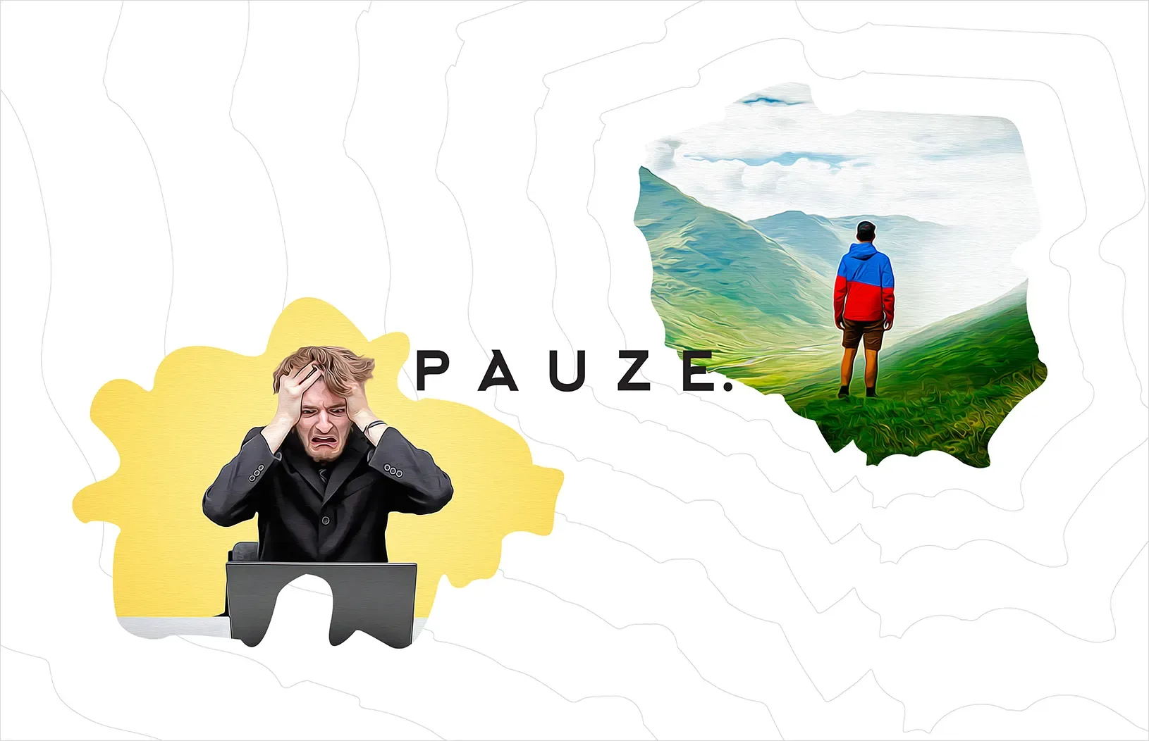
Most new travel agencies fight for attention with the same tired imagery: sunsets, beaches, and stock-photo smiles. Pauze refused to play that game.
Instead, it built a travel branding strategy rooted in a single, powerful idea: turn tourists into travelers. The result wasn't just a prettier logo - it was a 72% inquiry-to-client conversion rate within days of launch.
Here's how a thoughtful brand identity design process helped a brand-new travel agency cut through a hyper-competitive market, and what any travel business can learn from it.
The Challenge: Standing Out in a Saturated Travel Market
The travel industry has exploded over the past decade, and travelers now have endless options for planning their next trip. For a brand-new company like Pauze, blending in wasn't an option.
The brief was clear but demanding:
Reject traditional, expected travel marketing visuals
Create something inspirational rather than transactional
Speak to a varied set of customers with one cohesive voice
Make the brand memorable from the very first impression
This meant the branding couldn't just look nice. It had to carry a message: travel isn't a checklist, it's an experience.
Building the Foundation: Research Before Design
Before a single design element was created, the strategy started with audience research. Understanding who Pauze's travelers actually were - their motivations, frustrations, and aspirations - shaped every decision that followed.
This research-first approach is a core principle of effective travel agency branding: design should solve a communication problem, not just decorate a page. Once the target audience and positioning were clear, the visual identity could be built to match.
Logo Design and Visual Identity
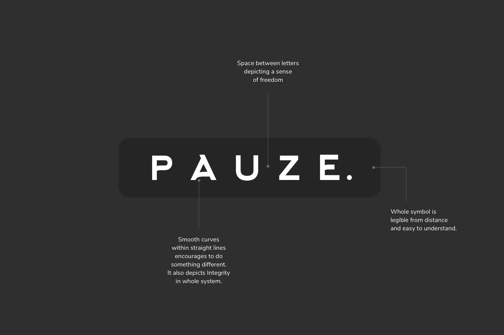
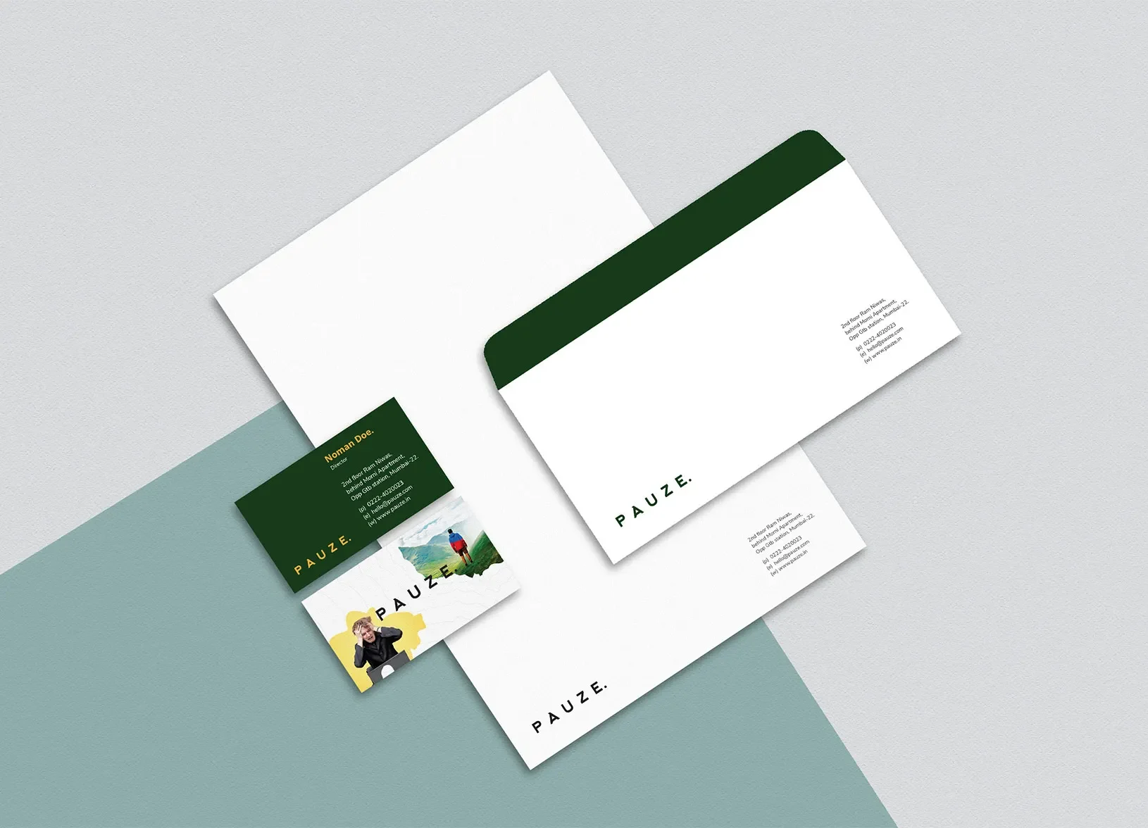
The logo design for travel brands needed to do more than identify the company - it had to embody Pauze's entire philosophy in a single mark.
Symbolism in the Details
The Pauze logo uses smooth curves set against straight lines, representing the brand's refusal to "do things the usual way." A single dot at the end of the mark signifies something specific: Pauze as a one-stop solution for every traveler's needs, from planning to booking.
A Deliberately Subtle Color Palette
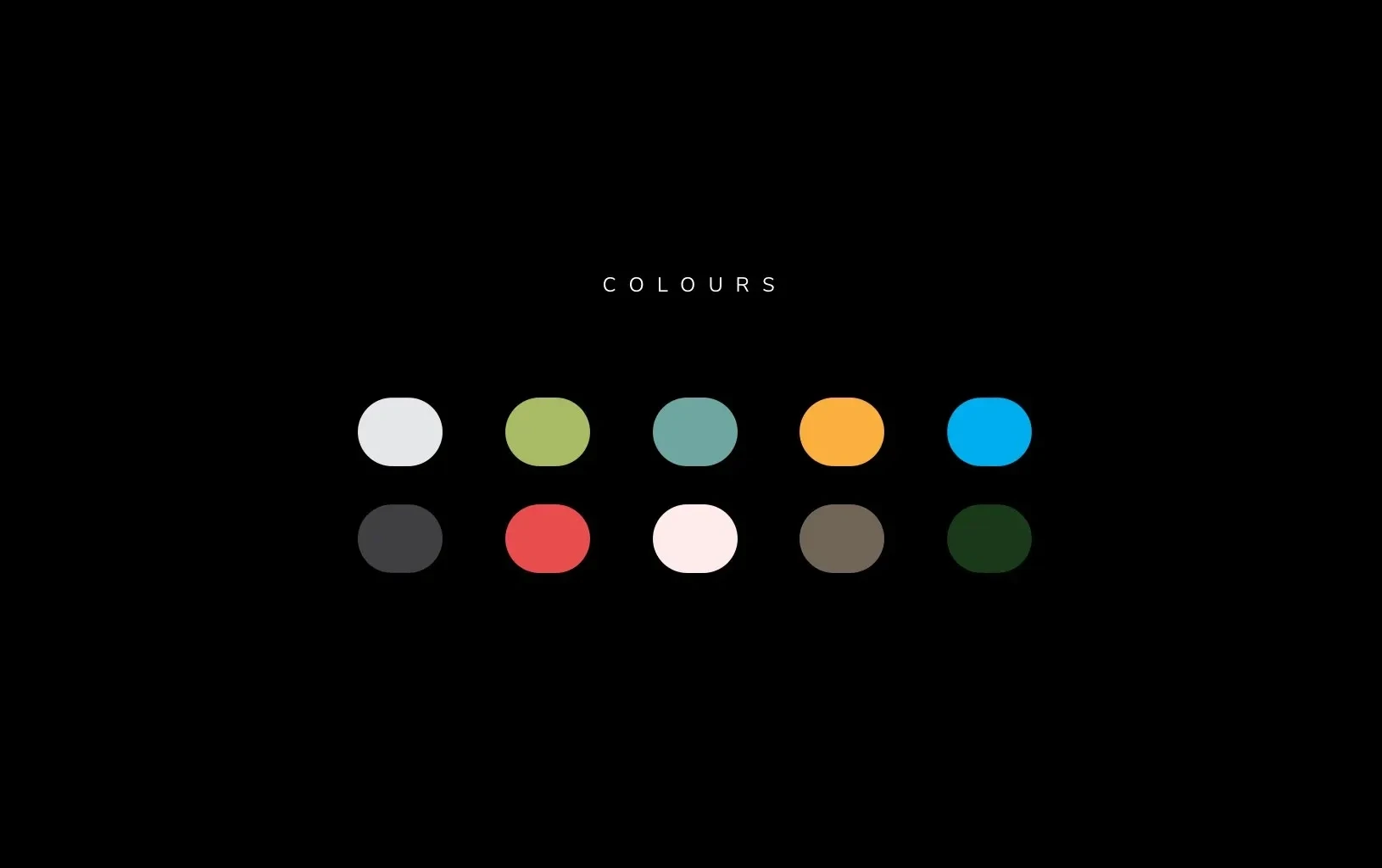
Rather than loud, saturated tones, Pauze's color range was kept intentionally muted. The reasoning was practical as much as aesthetic - a softer palette keeps customers comfortable on digital platforms for longer, without eye strain, which naturally increases time-on-site and engagement.
Imagery With an Emotional Finish
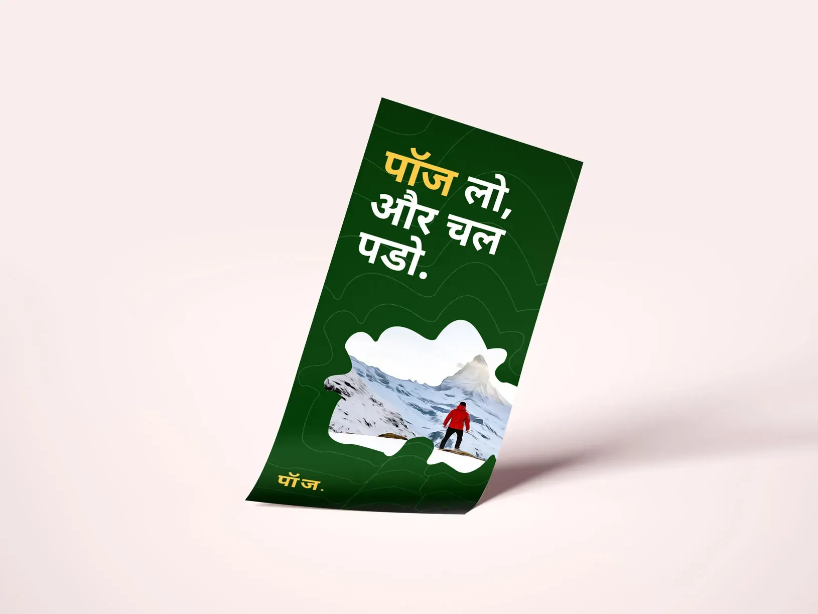
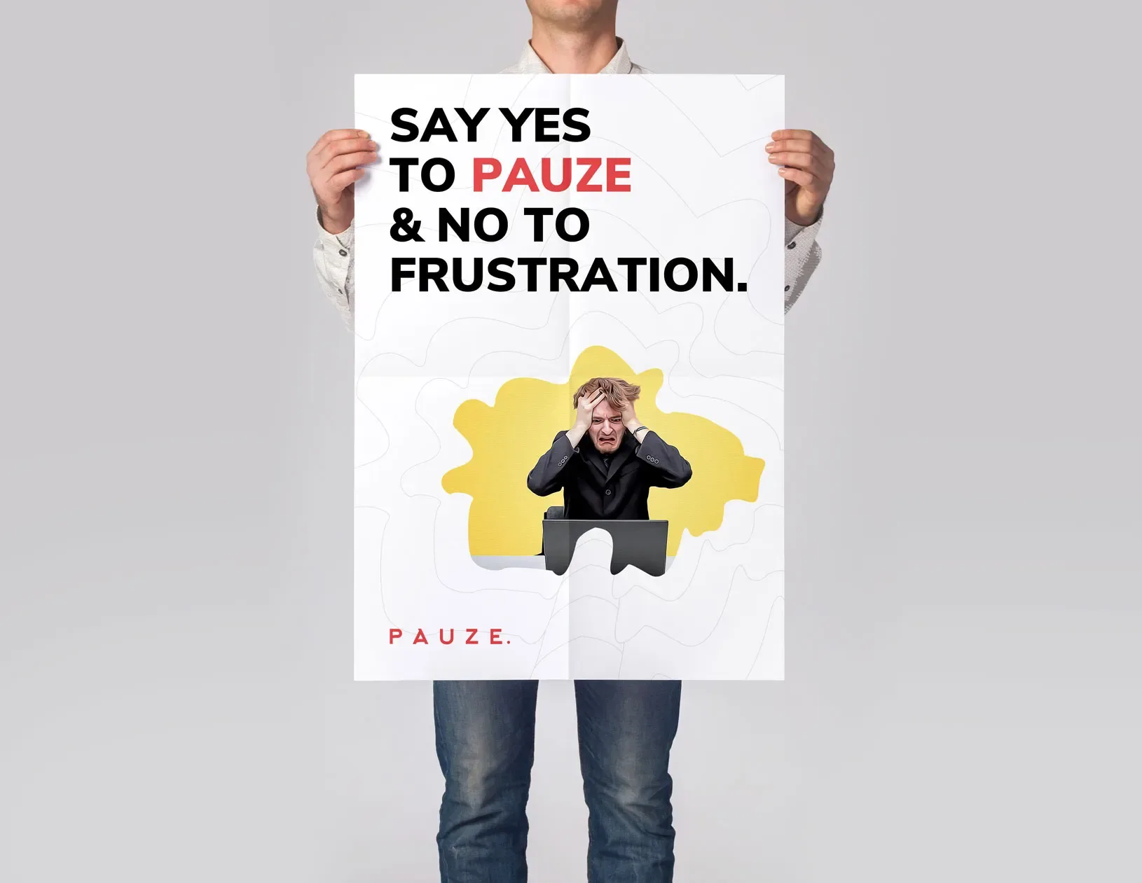
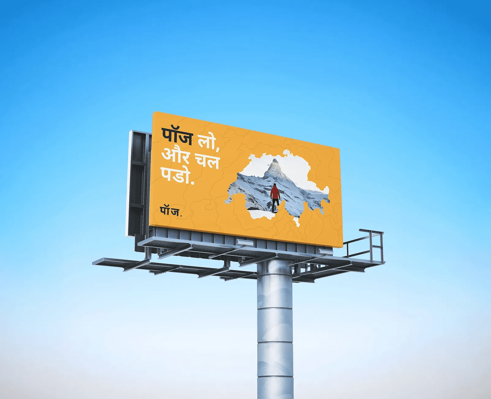
Photography was treated with an acrylic-paint finish, giving every image a distinctive, joyful texture. This wasn't decoration for its own sake - the goal was to evoke the specific feeling of contentment travelers experience at their destination, and to make viewers want that feeling for themselves.
Championing Solo Travel Branding
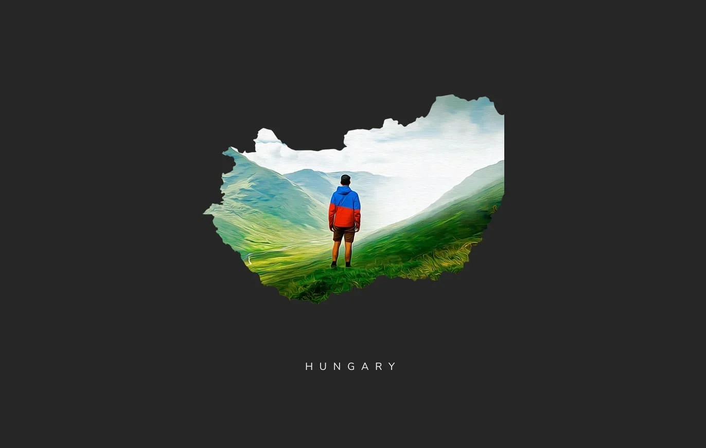
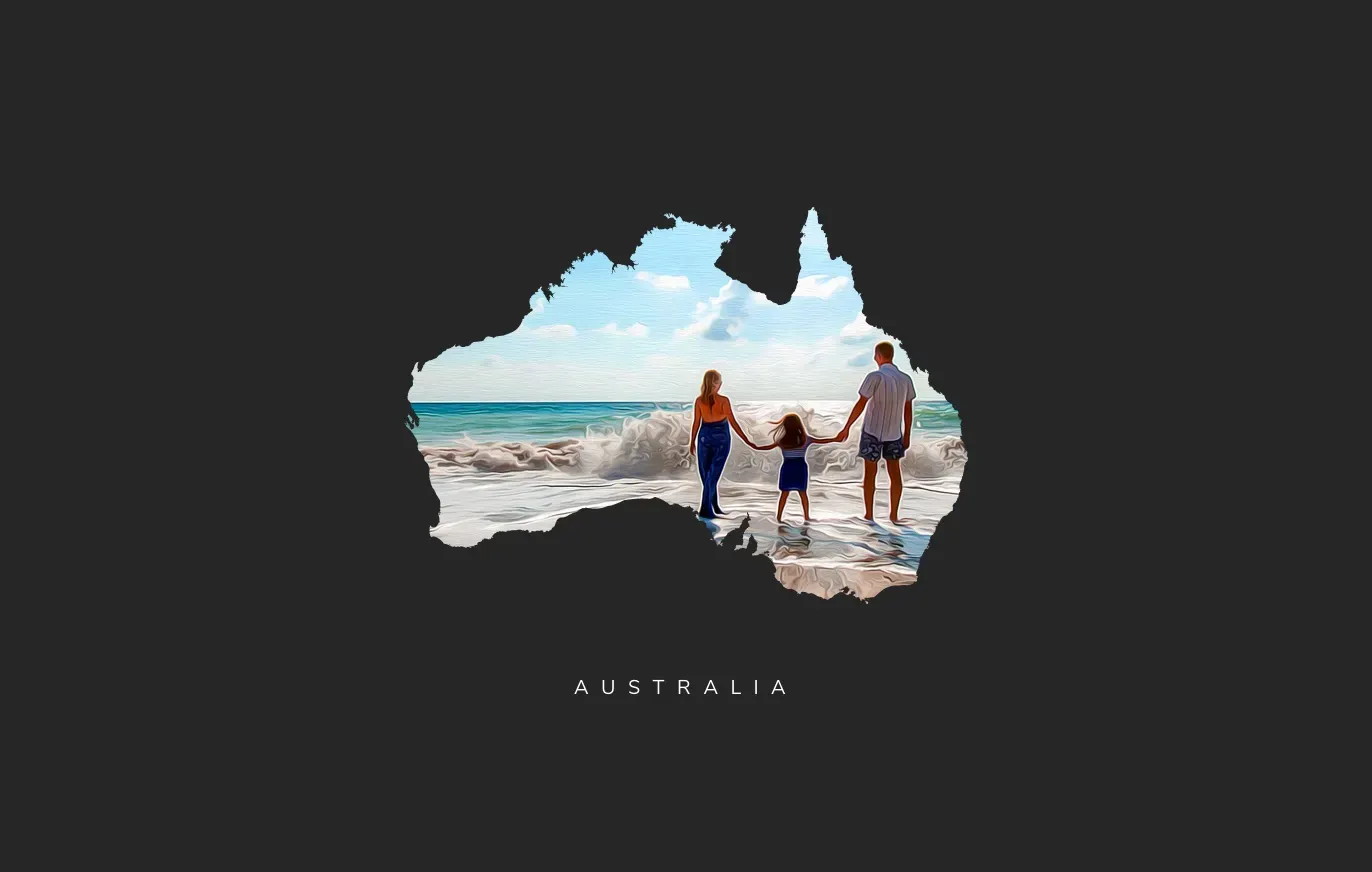
One of the sharpest strategic moves in this case study was Pauze's focus on solo travel branding.
Modern life leaves many people overworked and under-traveled. When they finally do think about a trip, the sheer number of decisions - where, when, how - can be paralyzing.
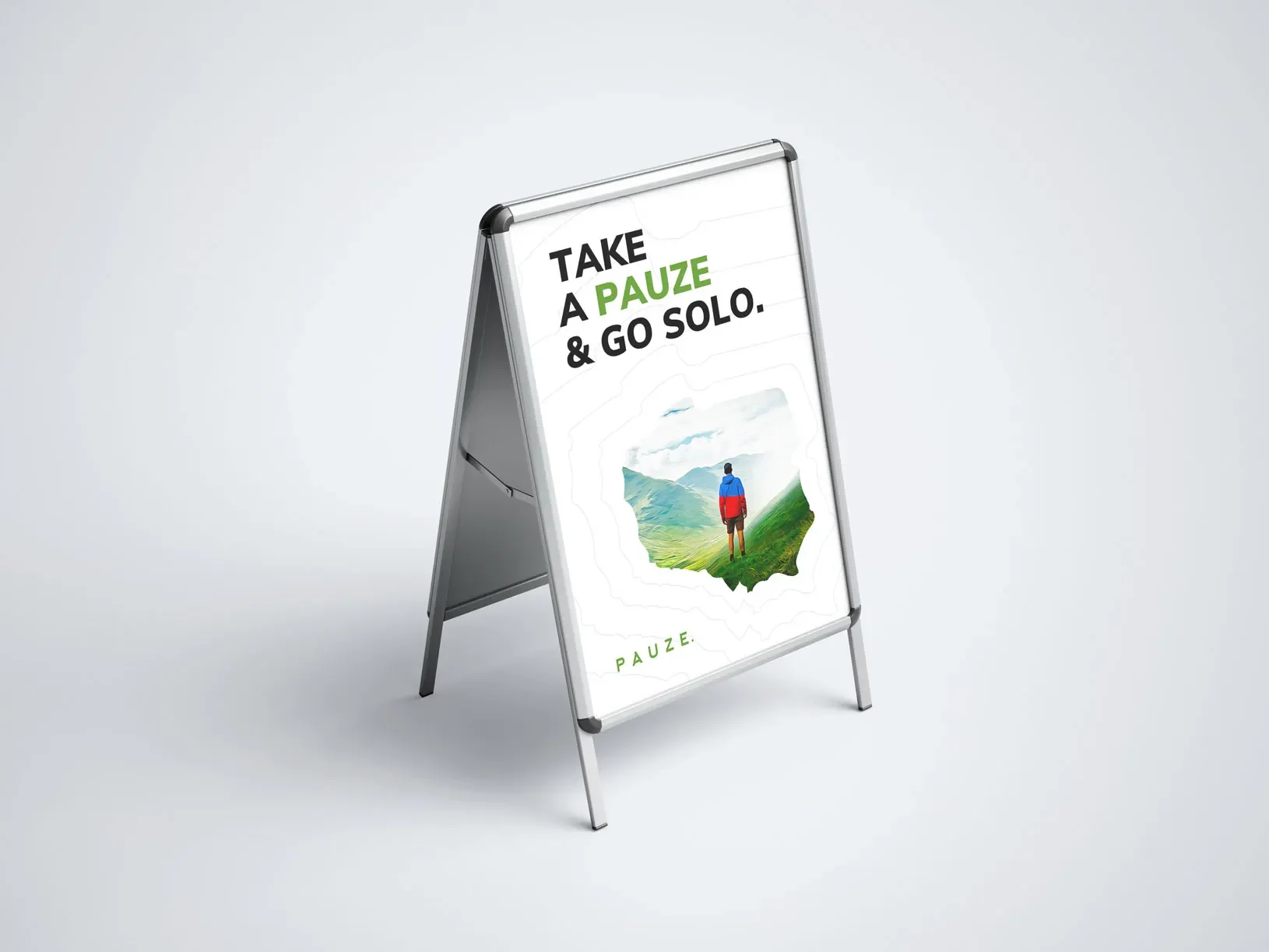
Pauze positioned itself as the answer: tailor-cut, hassle-free plans built specifically for solo travelers, with everything pre-arranged. To reinforce this visually, the design team incorporated abstract patterns resembling country maps, sparking curiosity and inviting travelers to identify (and then explore) the destinations behind each pattern.
This single positioning choice did two things at once:
Differentiated Pauze from generic, one-size-fits-all travel agencies
Created intrigue, encouraging potential customers to engage further with the brand
Digital Marketing for Travel Brands
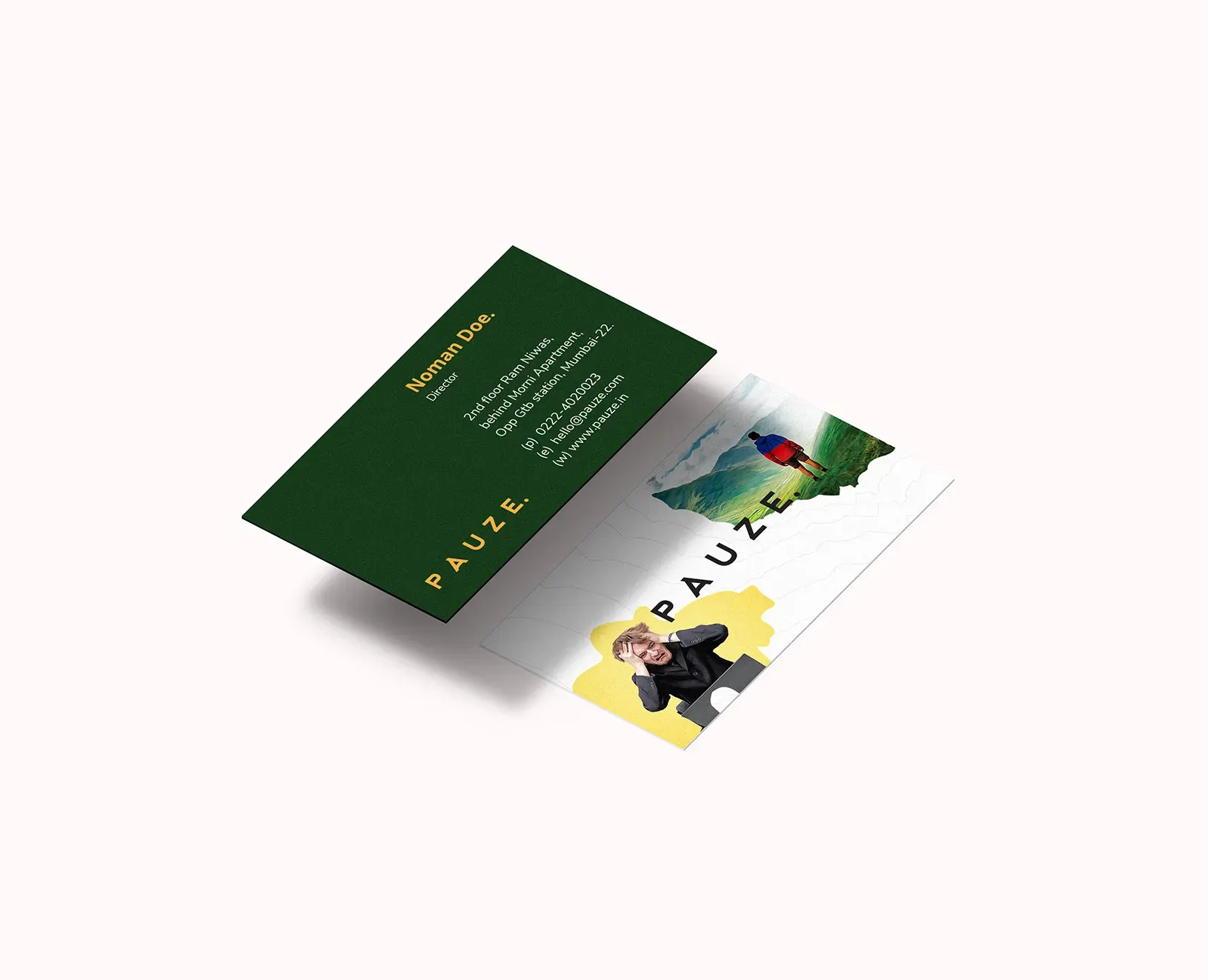
A strong identity means little if it doesn't translate to where travelers actually spend their time - social media.
The team designed distinctive Instagram and Facebook content that captured attention rather than blending into a feed. This approach to digital marketing for travel brands paid off:
Posts reached over 50,000 users across India
Content earned 10,000+ likes
A partnership with popular YouTube creator BeYouNick extended the brand's reach even further
Pairing consistent visual branding with the right influencer partnership gave Pauze credibility and visibility at the same time - a combination that's hard to buy through ads alone.
The Results: What Strong Branding Can Actually Deliver
Numbers tell the real story here. Within just three days of the brand's public launch, Pauze saw an overwhelming customer response.
Most notably, the conversion rate of inquiries into paying clients hit 72% - an exceptional figure for any new travel brand, let alone one just entering the market.
That result didn't come from luck. It came from a brand identity built specifically to make one point unmistakably clear: travel is essential, and Pauze exists to help people experience it fully.
Key Takeaways for Travel Brands
If you're building or refreshing a travel brand, Pauze's approach offers a practical blueprint:
Research your audience first. Design decisions should follow strategy, not the other way around.
Give your logo a story. Symbolism creates emotional resonance that generic marks can't match.
Choose colors with intent. Aesthetics and user experience should work together.
Find an underserved niche. Solo travelers were a clear, specific audience Pauze could own.
Match your visuals to your channels. What works in a logo needs to translate to Instagram, too
FAQ: Travel Branding Strategy
Why does branding matter so much for a new travel agency? In a crowded market, a distinct identity is often the only thing that stops a potential customer mid-scroll. Strong branding builds trust before a single trip is booked.
What makes a travel logo effective? The best travel logos combine visual simplicity with symbolic meaning, so the mark still communicates the brand's purpose even at a glance.
How important is color choice in travel branding? Very. Color affects mood, readability, and how long users stay engaged with digital content - all of which influence conversion.
Can niche positioning, like solo travel, really drive growth? Yes. Owning a specific niche, like Pauze did with solo travelers, makes messaging sharper and easier for the right customers to find and trust.
Ready to Build a Travel Brand That Converts?
Pauze proves that a thoughtful travel branding strategy - one built on research, symbolism, and a clear niche, can turn a brand new agency into a market favorite in days, not years.
If your travel business is ready for an identity that does more than look good, start with the same question Pauze did: what experience do you want your travelers to remember?